 Arga Fairuz

The following is a guide for using the Text On - Theme62 template. If you still don't understand it, you can ask in the comments column or via our contact for a faster response.
https://theme62.com/page/contact
Dashboard Template
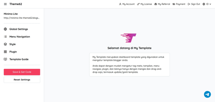
Theme62 has its own template dashboard which is used to customize your blogger template.
You can easily manage meta tags, appearance, navigation menus, plugins, and more by simply filling in and drag-and-drop, including updating/changing templates.
Please visit the following link to see the features of the Theme62 dashboard template.
https://theme62.com/my/template
Typography
Contains content writing style.
Heading
You can use H1-H6 headings in your content, but we don't recommend using H1 headings for SEO issues.
Code Example :
<h1>Heading 1</h1>
<h2>Heading 2</h2>
<h3>Heading 3</h3>
<h4>Heading 4</h4>
<h5>Heading 5</h5>
<h6>Heading 6</h6>
Result :
Heading 1
Heading 2
Heading 3
Heading 4
Heading 5
Heading 6
Paragraph
There are several paragraph styles that you can apply.
| Class | Description |
|---|---|
| indent | Paragraph is slightly indented on the first line. |
| dropcap | Capitalize the first letter of the paragraph. |
Paragraph Default
Paragraph default view
Code Example :
<p>Morbi iaculis nisl feugiat nisl aliquam, ac imperdiet ante condimentum. Orci varius natoque penatibus et magnis dis parturient montes, nascetur ridiculus mus. Nunc ex urna, interdum nec fermentum vitae, dictum nec odio.</p>
<p>Nunc lobortis, turpis sed fringilla condimentum, orci est sodales ipsum, et bibendum diam nulla nec lectus. Nullam a est massa. Pellentesque maximus commodo mollis. Phasellus viverra ullamcorper elit, vitae vehicula nisi iaculis at. Etiam efficitur porta pellentesque. Integer dictum leo porta nisi malesuada, at tempus est luctus.</p>
Result :
Morbi iaculis nisl feugiat nisl aliquam, ac imperdiet ante condimentum. Orci varius natoque penatibus et magnis dis parturient montes, nascetur ridiculus mus. Nunc ex urna, interdum nec fermentum vitae, dictum nec odio.
Nunc lobortis, turpis sed fringilla condimentum, orci est sodales ipsum, et bibendum diam nulla nec lectus. Nullam a est massa. Pellentesque maximus commodo mollis. Phasellus viverra ullamcorper elit, vitae vehicula nisi iaculis at. Etiam efficitur porta pellentesque. Integer dictum leo porta nisi malesuada, at tempus est luctus.
Paragraph Text Indent
Paragraph is slightly indented on the first line.
Code Example :
<p class="indent">Morbi iaculis nisl feugiat nisl aliquam, ac imperdiet ante condimentum. Orci varius natoque penatibus et magnis dis parturient montes, nascetur ridiculus mus. Nunc ex urna, interdum nec fermentum vitae, dictum nec odio.</p>
<p class="indent">Nunc lobortis, turpis sed fringilla condimentum, orci est sodales ipsum, et bibendum diam nulla nec lectus. Nullam a est massa. Pellentesque maximus commodo mollis. Phasellus viverra ullamcorper elit, vitae vehicula nisi iaculis at. Etiam efficitur porta pellentesque. Integer dictum leo porta nisi malesuada, at tempus est luctus.</p>
Result :
Morbi iaculis nisl feugiat nisl aliquam, ac imperdiet ante condimentum. Orci varius natoque penatibus et magnis dis parturient montes, nascetur ridiculus mus. Nunc ex urna, interdum nec fermentum vitae, dictum nec odio.
Nunc lobortis, turpis sed fringilla condimentum, orci est sodales ipsum, et bibendum diam nulla nec lectus. Nullam a est massa. Pellentesque maximus commodo mollis. Phasellus viverra ullamcorper elit, vitae vehicula nisi iaculis at. Etiam efficitur porta pellentesque. Integer dictum leo porta nisi malesuada, at tempus est luctus.
Paragraph Drop Cap
Capitalize the first letter of the paragraph.
Code Example :
<p class="dropcap">Morbi iaculis nisl feugiat nisl aliquam, ac imperdiet ante condimentum. Orci varius natoque penatibus et magnis dis parturient montes, nascetur ridiculus mus. Nunc ex urna, interdum nec fermentum vitae, dictum nec odio.</p>
<p>Nunc lobortis, turpis sed fringilla condimentum, orci est sodales ipsum, et bibendum diam nulla nec lectus. Nullam a est massa. Pellentesque maximus commodo mollis. Phasellus viverra ullamcorper elit, vitae vehicula nisi iaculis at. Etiam efficitur porta pellentesque. Integer dictum leo porta nisi malesuada, at tempus est luctus.</p>
Result :
Morbi iaculis nisl feugiat nisl aliquam, ac imperdiet ante condimentum. Orci varius natoque penatibus et magnis dis parturient montes, nascetur ridiculus mus. Nunc ex urna, interdum nec fermentum vitae, dictum nec odio.
Nunc lobortis, turpis sed fringilla condimentum, orci est sodales ipsum, et bibendum diam nulla nec lectus. Nullam a est massa. Pellentesque maximus commodo mollis. Phasellus viverra ullamcorper elit, vitae vehicula nisi iaculis at. Etiam efficitur porta pellentesque. Integer dictum leo porta nisi malesuada, at tempus est luctus.
Blockquote
Used to create quotes.
Code Example :
<blockquote>Lorem ipsum dolor sit amet, consectetur adipiscing elit, sed do eiusmod tempor incididunt ut labore et dolore magna aliqua.</blockquote>
Result :
Lorem ipsum dolor sit amet, consectetur adipiscing elit, sed do eiusmod tempor incididunt ut labore et dolore magna aliqua.
Styling Text
Code Example :
<p>Press <kbd>Ctrl</kbd> + <kbd>C</kbd> to copy text</p>
<p>Example of <a href="#">Link</a> text</p>
<p>Example of <a href="#" target="_blank">Link new tab</a> text</p>
<p>Example of <abbr title="Abbreviation">abbr</abbr> text</p>
<p>Example of <mark>highlight</mark> text</p>
<p>Example of <del>deleted</del> text</p>
<p>Example of <b>bold</b> text</p>
<p>Example of <i>italic</i> text</p>
<p>Example of <u>underlined</u> text</p>
<p>Example of <sub>subscripted</sub> text</p>
<p>Example of <sup>superscripted</sup> text</p>
Result :
Press Ctrl + C to copy text
Example of Link text
Example of Link new tab text
Example of abbr text
Example of highlight text
Example of deleted text
Example of bold text
Example of italic text
Example of underlined text
Example of subscripted text
Example of superscripted text
Button Link
Used to create link buttons, there are several styles of link buttons that you can apply.
Code Example :
<a class="button" href="#">Default Button</a>
<a class="button rounded" href="#">Rounded Button</a>
<a class="button outlined" href="#">Outlined Button</a>
<a class="button icon-download" href="#">Download</a>
<a class="button rounded outlined icon-download" href="#">Mix Button</a>
Result :
Download Link
Used to create a download button with additional elements.
Download Link Default
Default display download link.
Code Example :
<div class="box-download">
  <div>
    xml
  </div>
  <div>
    <span>template.xml</span>
    <span>150KB</span>
  </div>
  <div>
    <a href="#" class="button icon-download">Download</a>
  </div>
</div>
Result :
Download Link + Icon
You only need to add the svg code, the recommended size is 24px.
Code Example :
<div class="box-download">
  <div>
    <svg xmlns="http://www.w3.org/2000/svg" height="24" width="24"><path d="M4 20q-.825 0-1.412-.587Q2 18.825 2 18V6q0-.825.588-1.412Q3.175 4 4 4h6l2 2h8q.825 0 1.413.588Q22 7.175 22 8v10q0 .825-.587 1.413Q20.825 20 20 20Zm12-2h4V8h-4v2h2v2h-2v2h2v2h-2ZM4 18h10v-2h2v-2h-2v-2h2v-2h-2V8h-2.825l-2-2H4v12ZM4 8V6v12V8Z"/></svg>
  </div>
  <div>
    <span>template.zip</span>
    <span>150KB</span>
  </div>
  <div>
    <a href="#" class="button icon-download">Download</a>
  </div>
</div>
Result :
Download Link + Image
You just need to add the image using img.
Code Example :
<div class="box-download">
  <div>
    <img src="https://play-lh.googleusercontent.com/cF_oWC9Io_I9smEBhjhUHkOO6vX5wMbZJgFpGny4MkMMtz25iIJEh2wASdbbEN7jseAx=s64-rw">
  </div>
  <div>
    <span>Google Chat</span>
    <span>Google LLC</span>
  </div>
  <div>
    <a href="#" class="button icon-download">Download</a>
  </div>
</div>
Result :

Download Link + Image + Transparent
Used to remove the gray background.
Code Example :
<div class="box-download">
  <div class="transparent">
    <img src="https://play-lh.googleusercontent.com/cF_oWC9Io_I9smEBhjhUHkOO6vX5wMbZJgFpGny4MkMMtz25iIJEh2wASdbbEN7jseAx=s64-rw">
  </div>
  <div>
    <span>Google Chat</span>
    <span>Google LLC</span>
  </div>
  <div>
    <a href="#" class="button icon-download">Download</a>
  </div>
</div>
Result :
List
Used to list symbol or number.
List symbol
Code Example :
<ul>
  <li>List 1</li>
  <li>List 2
    <ul>
      <li>Sub List 2.1</li>
      <li>Sub List 2.2</li>
      <li>Sub List 2.3</li>
    </ul>
  </li>
  <li>List 3</li>
  <li>List 4</li>
</ul>
Result :
- List 1
- List 2
- Sub List 2.1
- Sub List 2.2
- Sub List 2.3
- List 3
- List 4
List number
Code Example :
<ol>
  <li>List 1</li>
  <li>List 2
    <ol>
      <li>Sub List 2.1</li>
      <li>Sub List 2.2</li>
      <li>Sub List 2.3</li>
    </ol>
  </li>
  <li>List 3</li>
  <li>List 4</li>
</ol>
Result :
- List 1
- List 2
- Sub List 2.1
- Sub List 2.2
- Sub List 2.3
- List 3
- List 4
Table
There are several table styles that you can apply.
| Class | Description |
|---|---|
| table-compact | Each line is tighter |
| table-header | Adds a block of color to the table header |
| table-striped | Adds a zebra-striping style between rows |
| table-hover | Enables hover on the rows |
| table-sticky-t | The first line always appears at the top even when scrolled |
| table-sticky-l | The leftmost column always appears to the left even when scrolled |
| table-border-box | Adds a border to the side of the table |
| table-border-x | Adds a horizontal border |
| table-border-y | Adds a vertical border |
| table-noborder-box | Removes the border on the side of the table |
| table-noborder-x | Removes the horizontal border |
| table-noborder-y | Removes the vertical border |
| table-none | Removes table formatting from Theme62 templates |
Table Default
The default table view uses the style table-border-box table-border-x, so you don't need to add it.
Code Example :
<table>
  <thead>
    <tr>
      <th>No</th>
      <th>Table Header 1</th>
      <th>Table Header 2</th>
      <th>Table Header 3</th>
      <th>Table Header 4</th>
      <th>Table Header 5</th>
      <th>Table Header 6</th>
    </tr>
  </thead>
  <tbody>
    <tr>
      <td>1</td>
      <td>Division 1.1</td>
      <td>Division 2.1</td>
      <td>Division 3.1</td>
      <td>Division 4.1</td>
      <td>Division 5.1</td>
      <td>Division 6.1</td>
    </tr>
    <tr>
      <td>2</td>
      <td>Division 1.2</td>
      <td>Division 2.2</td>
      <td>Division 3.2</td>
      <td>Division 4.2</td>
      <td>Division 5.2</td>
      <td>Division 6.2</td>
    </tr>
    <tr>
      <td>3</td>
      <td>Division 1.3</td>
      <td>Division 2.3</td>
      <td>Division 3.3</td>
      <td>Division 4.3</td>
      <td>Division 5.3</td>
      <td>Division 6.3</td>
    </tr>
    <tr>
      <td>4</td>
      <td>Division 1.4</td>
      <td>Division 2.4</td>
      <td>Division 3.4</td>
      <td>Division 4.4</td>
      <td>Division 5.4</td>
      <td>Division 6.4</td>
    </tr>
    <tr>
      <td>5</td>
      <td>Division 1.5</td>
      <td>Division 2.5</td>
      <td>Division 3.5</td>
      <td>Division 4.5</td>
      <td>Division 5.5</td>
      <td>Division 6.5</td>
    </tr>
    <tr>
      <td>6</td>
      <td>Division 1.6</td>
      <td>Division 2.6</td>
      <td>Division 3.6</td>
      <td>Division 4.6</td>
      <td>Division 5.6</td>
      <td>Division 6.6</td>
    </tr>
    <tr>
      <td>7</td>
      <td>Division 1.7</td>
      <td>Division 2.7</td>
      <td>Division 3.7</td>
      <td>Division 4.7</td>
      <td>Division 5.7</td>
      <td>Division 6.7</td>
    </tr>
    <tr>
      <td>8</td>
      <td>Division 1.8</td>
      <td>Division 2.8</td>
      <td>Division 3.8</td>
      <td>Division 4.8</td>
      <td>Division 5.8</td>
      <td>Division 6.8</td>
    </tr>
  </tbody>
</table>
Result :
| No | Table Header 1 | Table Header 2 | Table Header 3 | Table Header 4 | Table Header 5 | Table Header 6 |
|---|---|---|---|---|---|---|
| 1 | Division 1.1 | Division 2.1 | Division 3.1 | Division 4.1 | Division 5.1 | Division 6.1 |
| 2 | Division 1.2 | Division 2.2 | Division 3.2 | Division 4.2 | Division 5.2 | Division 6.2 |
| 3 | Division 1.3 | Division 2.3 | Division 3.3 | Division 4.3 | Division 5.3 | Division 6.3 |
| 4 | Division 1.4 | Division 2.4 | Division 3.4 | Division 4.4 | Division 5.4 | Division 6.4 |
| 5 | Division 1.5 | Division 2.5 | Division 3.5 | Division 4.5 | Division 5.5 | Division 6.5 |
| 6 | Division 1.6 | Division 2.6 | Division 3.6 | Division 4.6 | Division 5.6 | Division 6.6 |
| 7 | Division 1.7 | Division 2.7 | Division 3.7 | Division 4.7 | Division 5.7 | Division 6.7 |
| 8 | Division 1.8 | Division 2.8 | Division 3.8 | Division 4.8 | Division 5.8 | Division 6.8 |
Table Compact
Each line is tighter.
Code Example :
<table class="table-compact">
  ...same code as before...
</table>
Result :
| No | Table Header 1 | Table Header 2 | Table Header 3 | Table Header 4 | Table Header 5 | Table Header 6 |
|---|---|---|---|---|---|---|
| 1 | Division 1.1 | Division 2.1 | Division 3.1 | Division 4.1 | Division 5.1 | Division 6.1 |
| 2 | Division 1.2 | Division 2.2 | Division 3.2 | Division 4.2 | Division 5.2 | Division 6.2 |
| 3 | Division 1.3 | Division 2.3 | Division 3.3 | Division 4.3 | Division 5.3 | Division 6.3 |
| 4 | Division 1.4 | Division 2.4 | Division 3.4 | Division 4.4 | Division 5.4 | Division 6.4 |
| 5 | Division 1.5 | Division 2.5 | Division 3.5 | Division 4.5 | Division 5.5 | Division 6.5 |
| 6 | Division 1.6 | Division 2.6 | Division 3.6 | Division 4.6 | Division 5.6 | Division 6.6 |
| 7 | Division 1.7 | Division 2.7 | Division 3.7 | Division 4.7 | Division 5.7 | Division 6.7 |
| 8 | Division 1.8 | Division 2.8 | Division 3.8 | Division 4.8 | Division 5.8 | Division 6.8 |
Table Header
Adds a block of color to the table header
Code Example :
<table class="table-header">
  ...same code as before...
</table>
Result :
| No | Table Header 1 | Table Header 2 | Table Header 3 | Table Header 4 | Table Header 5 | Table Header 6 |
|---|---|---|---|---|---|---|
| 1 | Division 1.1 | Division 2.1 | Division 3.1 | Division 4.1 | Division 5.1 | Division 6.1 |
| 2 | Division 1.2 | Division 2.2 | Division 3.2 | Division 4.2 | Division 5.2 | Division 6.2 |
| 3 | Division 1.3 | Division 2.3 | Division 3.3 | Division 4.3 | Division 5.3 | Division 6.3 |
| 4 | Division 1.4 | Division 2.4 | Division 3.4 | Division 4.4 | Division 5.4 | Division 6.4 |
| 5 | Division 1.5 | Division 2.5 | Division 3.5 | Division 4.5 | Division 5.5 | Division 6.5 |
| 6 | Division 1.6 | Division 2.6 | Division 3.6 | Division 4.6 | Division 5.6 | Division 6.6 |
| 7 | Division 1.7 | Division 2.7 | Division 3.7 | Division 4.7 | Division 5.7 | Division 6.7 |
| 8 | Division 1.8 | Division 2.8 | Division 3.8 | Division 4.8 | Division 5.8 | Division 6.8 |
Table Striped
Adds a zebra-striping style between rows.
Code Example :
<table class="table-striped">
  ...same code as before...
</table>
Result :
| No | Table Header 1 | Table Header 2 | Table Header 3 | Table Header 4 | Table Header 5 | Table Header 6 |
|---|---|---|---|---|---|---|
| 1 | Division 1.1 | Division 2.1 | Division 3.1 | Division 4.1 | Division 5.1 | Division 6.1 |
| 2 | Division 1.2 | Division 2.2 | Division 3.2 | Division 4.2 | Division 5.2 | Division 6.2 |
| 3 | Division 1.3 | Division 2.3 | Division 3.3 | Division 4.3 | Division 5.3 | Division 6.3 |
| 4 | Division 1.4 | Division 2.4 | Division 3.4 | Division 4.4 | Division 5.4 | Division 6.4 |
| 5 | Division 1.5 | Division 2.5 | Division 3.5 | Division 4.5 | Division 5.5 | Division 6.5 |
| 6 | Division 1.6 | Division 2.6 | Division 3.6 | Division 4.6 | Division 5.6 | Division 6.6 |
| 7 | Division 1.7 | Division 2.7 | Division 3.7 | Division 4.7 | Division 5.7 | Division 6.7 |
| 8 | Division 1.8 | Division 2.8 | Division 3.8 | Division 4.8 | Division 5.8 | Division 6.8 |
Table Hover
Enables hover on the rows.
Code Example :
<table class="table-hover">
  ...same code as before...
</table>
Result :
| No | Table Header 1 | Table Header 2 | Table Header 3 | Table Header 4 | Table Header 5 | Table Header 6 |
|---|---|---|---|---|---|---|
| 1 | Division 1.1 | Division 2.1 | Division 3.1 | Division 4.1 | Division 5.1 | Division 6.1 |
| 2 | Division 1.2 | Division 2.2 | Division 3.2 | Division 4.2 | Division 5.2 | Division 6.2 |
| 3 | Division 1.3 | Division 2.3 | Division 3.3 | Division 4.3 | Division 5.3 | Division 6.3 |
| 4 | Division 1.4 | Division 2.4 | Division 3.4 | Division 4.4 | Division 5.4 | Division 6.4 |
| 5 | Division 1.5 | Division 2.5 | Division 3.5 | Division 4.5 | Division 5.5 | Division 6.5 |
| 6 | Division 1.6 | Division 2.6 | Division 3.6 | Division 4.6 | Division 5.6 | Division 6.6 |
| 7 | Division 1.7 | Division 2.7 | Division 3.7 | Division 4.7 | Division 5.7 | Division 6.7 |
| 8 | Division 1.8 | Division 2.8 | Division 3.8 | Division 4.8 | Division 5.8 | Division 6.8 |
Table Sticky
The first row or column always appears even when scrolled.
Code Example :
<table class="table-sticky-t">
  ...same code as before...
</table>
Result :
| No | Table Header 1 | Table Header 2 | Table Header 3 | Table Header 4 | Table Header 5 | Table Header 6 |
|---|---|---|---|---|---|---|
| 1 | Division 1.1 | Division 2.1 | Division 3.1 | Division 4.1 | Division 5.1 | Division 6.1 |
| 2 | Division 1.2 | Division 2.2 | Division 3.2 | Division 4.2 | Division 5.2 | Division 6.2 |
| 3 | Division 1.3 | Division 2.3 | Division 3.3 | Division 4.3 | Division 5.3 | Division 6.3 |
| 4 | Division 1.4 | Division 2.4 | Division 3.4 | Division 4.4 | Division 5.4 | Division 6.4 |
| 5 | Division 1.5 | Division 2.5 | Division 3.5 | Division 4.5 | Division 5.5 | Division 6.5 |
| 6 | Division 1.6 | Division 2.6 | Division 3.6 | Division 4.6 | Division 5.6 | Division 6.6 |
| 7 | Division 1.7 | Division 2.7 | Division 3.7 | Division 4.7 | Division 5.7 | Division 6.7 |
| 8 | Division 1.8 | Division 2.8 | Division 3.8 | Division 4.8 | Division 5.8 | Division 6.8 |
Table Border
Add or remove borders in tables.
Code Example :
<table class="table-noborder-box table-border-y">
  ...same code as before...
</table>
Result :
| No | Table Header 1 | Table Header 2 | Table Header 3 | Table Header 4 | Table Header 5 | Table Header 6 |
|---|---|---|---|---|---|---|
| 1 | Division 1.1 | Division 2.1 | Division 3.1 | Division 4.1 | Division 5.1 | Division 6.1 |
| 2 | Division 1.2 | Division 2.2 | Division 3.2 | Division 4.2 | Division 5.2 | Division 6.2 |
| 3 | Division 1.3 | Division 2.3 | Division 3.3 | Division 4.3 | Division 5.3 | Division 6.3 |
| 4 | Division 1.4 | Division 2.4 | Division 3.4 | Division 4.4 | Division 5.4 | Division 6.4 |
| 5 | Division 1.5 | Division 2.5 | Division 3.5 | Division 4.5 | Division 5.5 | Division 6.5 |
| 6 | Division 1.6 | Division 2.6 | Division 3.6 | Division 4.6 | Division 5.6 | Division 6.6 |
| 7 | Division 1.7 | Division 2.7 | Division 3.7 | Division 4.7 | Division 5.7 | Division 6.7 |
| 8 | Division 1.8 | Division 2.8 | Division 3.8 | Division 4.8 | Division 5.8 | Division 6.8 |
Table None
Removed table formatting from Theme62 templates.
Code Example :
<table class="table-none">
  ...same code as before...
</table>
Result :
| No | Table Header 1 | Table Header 2 | Table Header 3 | Table Header 4 | Table Header 5 | Table Header 6 |
|---|---|---|---|---|---|---|
| 1 | Division 1.1 | Division 2.1 | Division 3.1 | Division 4.1 | Division 5.1 | Division 6.1 |
| 2 | Division 1.2 | Division 2.2 | Division 3.2 | Division 4.2 | Division 5.2 | Division 6.2 |
| 3 | Division 1.3 | Division 2.3 | Division 3.3 | Division 4.3 | Division 5.3 | Division 6.3 |
| 4 | Division 1.4 | Division 2.4 | Division 3.4 | Division 4.4 | Division 5.4 | Division 6.4 |
| 5 | Division 1.5 | Division 2.5 | Division 3.5 | Division 4.5 | Division 5.5 | Division 6.5 |
| 6 | Division 1.6 | Division 2.6 | Division 3.6 | Division 4.6 | Division 5.6 | Division 6.6 |
| 7 | Division 1.7 | Division 2.7 | Division 3.7 | Division 4.7 | Division 5.7 | Division 6.7 |
| 8 | Division 1.8 | Division 2.8 | Division 3.8 | Division 4.8 | Division 5.8 | Division 6.8 |
Table Mix
Add multiple styles to a table at once.
Code Example :
<table class="table-header table-striped table-hover table-sticky-t table-sticky-l table-border-y">
  ...same code as before...
</table>
Result :
| No | Table Header 1 | Table Header 2 | Table Header 3 | Table Header 4 | Table Header 5 | Table Header 6 |
|---|---|---|---|---|---|---|
| 1 | Division 1.1 | Division 2.1 | Division 3.1 | Division 4.1 | Division 5.1 | Division 6.1 |
| 2 | Division 1.2 | Division 2.2 | Division 3.2 | Division 4.2 | Division 5.2 | Division 6.2 |
| 3 | Division 1.3 | Division 2.3 | Division 3.3 | Division 4.3 | Division 5.3 | Division 6.3 |
| 4 | Division 1.4 | Division 2.4 | Division 3.4 | Division 4.4 | Division 5.4 | Division 6.4 |
| 5 | Division 1.5 | Division 2.5 | Division 3.5 | Division 4.5 | Division 5.5 | Division 6.5 |
| 6 | Division 1.6 | Division 2.6 | Division 3.6 | Division 4.6 | Division 5.6 | Division 6.6 |
| 7 | Division 1.7 | Division 2.7 | Division 3.7 | Division 4.7 | Division 5.7 | Division 6.7 |
| 8 | Division 1.8 | Division 2.8 | Division 3.8 | Division 4.8 | Division 5.8 | Division 6.8 |
Columns
Used to make several elements into a stack of columns.
There are several columns styles you can apply.
| Style | Description |
|---|---|
| --gap | Gaps between elements, default: 10px |
| --num | Number of columns, default: 2 |
| --num-xs | Number of columns if screen size >450px |
| --num-sm | Number of columns if screen size >600px |
| --num-md | Number of columns if screen size >768px |
| --num-lg | Number of columns if screen size >992px |
Code Example :
<div class="columns" style="--num-sm: 3; --num-lg: 5">
  <div>
    <img src="https://blogger.googleusercontent.com/img/b/R29vZ2xl/AVvXsEgktR8BN6vDqJ75oOCn39JheCP3h0yKmVoQppRO0SSaa9qS8RJIGhQ-5mDL7QwnICemURkWND8tDbVmC65MCSJe_-noAWnbi0IPofWw4bxAoNcpXnRvAg0MbIv4gyy7tWiMIoWBd4hr32V54bclU0IpeeLJNAySjPxzifTDdjTA6S2LF4QR-kWvimy6/s1600/example-1.jpg">
  </div>
  <div>
    <img src="https://blogger.googleusercontent.com/img/b/R29vZ2xl/AVvXsEjKT0L8FHZZAAq090ciHugt6KxfE-F4GbG9iw56wsM6I79Ci4YxRz5DqksdPvqBsN-H0pDWx2ddOXNalmWudQ4hGy7nyJFuvjfKQqFTQLIk_RmM3Vj72zBm4d_eDHgxRTrrstbK-E89CK1j5cq-18N_FpOzg724r4kfo-dFVwmndOb1yBAwrHw4306m/s1600/example-2.jpg">
  </div>
  <div>
    <img src="https://blogger.googleusercontent.com/img/b/R29vZ2xl/AVvXsEhLlmu_j-1aCGEWQMm_6urYT3khUg7TIJYTCZJpRu7ypwAQfuwKyw5acUoAZnu7er8ADCezZMZdYZNgiQaHEOZpbIhMOqYKxCojZMUEOlWFBsrgaPV9jDVyCjy6TS7145uUPKPp1pYbdUZZeWaXCL-ln_WOTarJ0MufACfPz3WXxIGxPZ-ZrWIdvhKF/s1600/example-3.jpg">
  </div>
  <div>
    <img src="https://blogger.googleusercontent.com/img/b/R29vZ2xl/AVvXsEjLobGRWj-S5e4pMi4WWQ8TxSQP3_SJqmeY9ZzaR97u1evTozjEX025h_4XGFn-SnnBpG4yKxF3uilYBtZEGGJmtDgtWAogqZUFRPYuqswWP3S12i9fQY5uyOLwZsDyFK66d5ZTaCFkY93VjHnd_f6q1GKAKLL7L5Hk8kwwoBdST7YjBEC64nYL38Lo/s1600/example-4.jpg">
  </div>
  <div>
    <img src="https://blogger.googleusercontent.com/img/b/R29vZ2xl/AVvXsEinWgL-DdsPXOGKZfk43mHn5ush45axO_51K3uW2Hyg-T-292e64eZOS5LMvJ9nVV2ycuSjUEUYA9Fkua_JqQLG-W_FGqGQ2nD7e1MlVoxlZjeaS_IOlQ5pMffRtNvdFl0Qm6SSo3b2tegz4JZqRaKdIlsTBakPd5bPMMvTJS4A7Mjz-i8UBDaqtTu3/s1600/example-5.jpg">
  </div>
  <div>
    <img src="https://blogger.googleusercontent.com/img/b/R29vZ2xl/AVvXsEhmKWsbtIJxRD1YIws2q7sHLF7DkMYizNNdZ6dq9C2uE9ejqjbEqfyX5WoeNQuU0nbQTFIbDBj8YkMIe2jmZNnxH35ypVNfkhrY_EFSlutz09kBO7-2SoEhLW408zbgQYRAGYFFxPgy_UGkurDs9lMOJbr_D_zMSthdwrQOs24FcF1o9bNl0mX7suCr/s1600/example-6.jpg">
  </div>
  <div>
    <img src="https://blogger.googleusercontent.com/img/b/R29vZ2xl/AVvXsEi2P7FJkb7s2Pwewg8sShUTimlvYCeCW0nij0cqx7GG1HLbu3_n44FAvtnjM0H1k5jsbomzBep1u5TyOE-DzgoiN_E2Rb8QPAHRrq-F4j5wtyaNSdepJidG3mueJwVViG7RmdRsBmw789NRQsYkE_p1rKzRzEy7dhjZvrKeRR1ucr0TYaM_yoIc21DI/s1600/example-7.jpg">
  </div>
  <div>
    <img src="https://blogger.googleusercontent.com/img/b/R29vZ2xl/AVvXsEjsMvrPDtdKxhILYShw2iRoBSpi_rp3HIxjOPiwwcKF2URYCld0Nj6GriGYcju7UI4YD0I-KuBcb2Kz5M5tgX66A52JsOh32zyEAHQsYv7DaRO-VhCTijtP2UE6wdhCQGTCHt7C5_tw2GVwvdRBdhyoS9l0j3kD1sJX3jzUO-VsB-4LmF8nemCt_bqZ/s1600/example-8.jpg">
  </div>
  <div>
    <img src="https://blogger.googleusercontent.com/img/b/R29vZ2xl/AVvXsEji6TdbBeAZjH0_cqs9Vp0ks1JxU5fMpkdIotvghd8ohJEyJyGfIMqW4VTxfFtZ0JrDSLsCpb5uCRd5wdLqEWebzE2YmpWFkLuBPxNei03vLJAI2jJXVgVIuSxUMKMa4gsEqcCx7l2BWb9FgVsC0GNhq3LD0Et6mkgK4TycIxQq4xgC2RMHh5LSBrjj/s1600/example-9.jpg">
  </div>
  <div>
    <img src="https://blogger.googleusercontent.com/img/b/R29vZ2xl/AVvXsEisRh2e3E64eVmQwxKPigiyynpmgusQFy3M8ZJ3pSx1No7ZGmfeJLz43xBLNV6x1NgU2hBWuJlckbEkiIvjyMRHN0aZkimhHJSxJggPSjLtv4e31_pmTpTedqFzCM3qnXaP2aNInGa_yOuadHjcUW9ZlQCRM1xy-3KRsTLLg74Ls4w9Fj1whtADxdIy/s1600/example-10.jpg">
  </div>
  <div>
    <img src="https://blogger.googleusercontent.com/img/b/R29vZ2xl/AVvXsEhprvdsLk-9jZ45DGa-3g-hqBvMoJA_jjW_Ty8o3j6hcAdPupYA8aZgITop0biJSRj-zfOTSO_8OFazBhYrd3cxahV_vzIsn9xZOAhwZ4QyuTzFavSSZ6XzYF9d6OvdQ98B06hIG5BBuefIVYibmOCq5eqngnudMWj-2zHJnOX_mGfM3hvjyjcdr85r/s1600/example-11.jpg">
  </div>
  <div>
    <img src="https://blogger.googleusercontent.com/img/b/R29vZ2xl/AVvXsEg5QiIPKkfWO77gytKUgaQErKCCYmrav5bF00mSefiItolGgk3lkAkrnO03wQzmr6ICUrnsKAkpAmZvBU-j9dCjJhSveE03JpfNp1tF6CZ1bhVhEw_r3gtbiiwNQzKkgIMJaAruHVZqg2NDAbIAJIXWFMyr_kF3QfnvQJzFFpnayhaHawdJ7B6I8epI/s1600/example-12.jpg">
  </div>
</div>
Result :


Slider/Carousel
Used to create slider/carousel.
There are several slider/carousel styles that you can apply.
| Style | Value | Description |
|---|---|---|
| --height | [length] |
The height of the slider. If not filled, the slider height will adjust the height of the slider element. |
| --timing | [time] |
Time to autoplay the slider. If not filled, then autoplay will be disabled. The recommended value is 4 seconds (4s). |
| --num | [num] |
Number of items on a slider. If using --timing, then --num is required. |
| --gap | [length] | Gap distance between slider items. |
| --space | [length] | Spacing between slider items. |
| --align | start|center|end | Alignment of slider items, useful if setting --space. |
Code Example :
<div class="slider" style="--align: center; --num: 3; --height: 250px; --timing: 4s;">
  <div class="slider-viewport">
    <div class="slider-item">
      <div class="slider-container">
          <!-- Your code -->
      </div>
    </div>
    <div class="slider-item">
      <div class="slider-container">
          <!-- Your code -->
      </div>
    </div>
    <div class="slider-item">
      <div class="slider-container">
          <!-- Your code -->
      </div>
    </div>
    <!-- Add item-slider if you want to add more items -->
  </div>
</div>
Result :
Alert
Used to create alert messages, there are several styles of alert you can apply.
Code Example :
<p class="alert alert-success">
  Lorem ipsum dolor sit amet, consectetur adipiscing elit, sed do eiusmod tempor incididunt ut labore et dolore magna aliqua
</p>
<p class="alert alert-info">
  Lorem ipsum dolor sit amet, consectetur adipiscing elit, sed do eiusmod tempor incididunt ut labore et dolore magna aliqua
</p>
<p class="alert alert-warning">
  Lorem ipsum dolor sit amet, consectetur adipiscing elit, sed do eiusmod tempor incididunt ut labore et dolore magna aliqua
</p>
<p class="alert alert-error">
  Lorem ipsum dolor sit amet, consectetur adipiscing elit, sed do eiusmod tempor incididunt ut labore et dolore magna aliqua
</p>
Result :
Lorem ipsum dolor sit amet, consectetur adipiscing elit, sed do eiusmod tempor incididunt ut labore et dolore magna aliqua
Lorem ipsum dolor sit amet, consectetur adipiscing elit, sed do eiusmod tempor incididunt ut labore et dolore magna aliqua
Lorem ipsum dolor sit amet, consectetur adipiscing elit, sed do eiusmod tempor incididunt ut labore et dolore magna aliqua
Lorem ipsum dolor sit amet, consectetur adipiscing elit, sed do eiusmod tempor incididunt ut labore et dolore magna aliqua
Accordion
Used to create content that can be closed and opened, there are several accordion functions that you can apply.
| Class | Description |
|---|---|
| accordion-single | Content only opens one |
| accordion-multiple | Content can be shared |
| open | Content will open at the start |
Accordion Default
The default accordion function uses accordion-multiple, so you don't need to add it.
Code Example :
<!-- Accordion (Start) -->
<div class="accordion">

  <!-- Box (Start) -->
  <div>
    <div class="accordion-title">
      Main Title 1
    </div>
    <div class="accordion-content">
      Lorem ipsum dolor sit amet, consectetur adipisicing elit, sed do eiusmod tempor incididunt ut labore et dolore magna aliqua. Ut enim ad minim veniam, quis nostrud exercitation ullamco laboris nisi ut aliquip ex ea commodo consequat.
    </div>
  </div>
  <!-- Box (End) -->

  <!-- Box (Start) -->
  <div>
    <div class="accordion-title">
      Main Title 2
    </div>
    <div class="accordion-content">
      Lorem ipsum dolor sit amet, consectetur adipisicing elit, sed do eiusmod tempor incididunt ut labore et dolore magna aliqua.

      <!-- Accordion (Start) -->
      <div class="accordion">

        <!-- Box (Start) -->
        <div>
          <div class="accordion-title">
             Subtitle 2.1
          </div>
          <div class="accordion-content">
            Lorem ipsum dolor sit amet, consectetur adipisicing elit, sed do eiusmod tempor incididunt ut labore et dolore magna aliqua. Ut enim ad minim veniam, quis nostrud exercitation ullamco laboris nisi ut aliquip ex ea commodo consequat.
          </div>
        </div>
        <!-- Box (End) -->

      </div>
      <!-- Accordion (End) -->

      Ut enim ad minim veniam, quis nostrud exercitation ullamco laboris nisi ut aliquip ex ea commodo consequat
    </div>
  </div>
  <!-- Box (End) -->

</div>
<!-- Accordion (End) -->
Result :
Accordion Single
So that only one accordion opens and the others close automatically, add the class accordion-single beside accordion.
Code Example :
<div class="accordion accordion-single">
Result :
Accordion Open
To make certain accordions open first, add the class open beside accordion-title.
Code Example :
<div class="accordion-title open">
Result :
Syntax Highlighter
Used to create a syntax highlighter, with the addition of numbered features and copy code.
Your code must be parsed before being applied with Syntax Highlighter, you can use the following HTML Parse tools :
| Attribute | Description |
|---|---|
| data-lang | Set syntax language |
| data-label | Set syntax label |
Syntax Highlighter Default
Without specifying data-lang and data-label only have numbered features and copy code, not with syntax highlighting.
Code Example :
<pre><code>
function getScore() {
  const num1 = 2;
  const num2 = 3;
  const name = 'Arga';
  return `${name} scored ${num1 + num2}`;
}

const score = getScore(); // Returns "Arga scored 5"
console.log(score);
</code></pre>
Result :
function getScore() {
const num1 = 2;
const num2 = 3;
const name = 'Arga';
return `${name} scored ${num1 + num2}`;
}
const score = getScore(); // Returns "Arga scored 5"
console.log(score);
Syntax Highlighter + mark
Used to mark important syntax with a variety of color options.
Valid color choice classes are as follows:
red, pink, purple, indigo, blue, cyan, teal, green, orange, brown.
The <mark> tag doesn't need to be parsed for it to work properly.
Code Example :
<pre><code>
function getScore() {
const <mark class="red">num1 = 2</mark>;
const <mark class="pink">num2 = 3</mark>;
const <mark class="purple">num3 = 4</mark>;
const <mark class="indigo">num4 = 5</mark>;
const <mark class="blue">num5 = 6</mark>;
const <mark class="cyan">num6 = 7</mark>;
const <mark class="teal">num7 = 8</mark>;
const <mark class="green">num8 = 9</mark>;
const <mark class="orange">num9 = 10</mark>;
const <mark class="brown">num10 = 11</mark>;
const name = 'Arga';
return `${name} scored ${num1 + num2}`;
}
const score = getScore(); // Returns "Arga scored 5"
console.log(score);
</code></pre>
Result :
function getScore() {
  const num1 = 2;
  const num2 = 3;
  const num3 = 4;
  const num4 = 5;
  const num5 = 6;
  const num6 = 7;
  const num7 = 8;
  const num8 = 9;
  const num9 = 10;
  const num10 = 11;
  const name = 'Arga';
  return `${name} scored ${num1 + num2}`;
}

const score = getScore(); // Returns "Arga scored 5"
console.log(score);
Syntax Highlighter + data-lang
Setting data-lang will highlight the syntax according to the specified language, data-label is auto-populated according to the language label.
The following languages are available :
| data-lang | Language Label |
|---|---|
| plain plaintext text txt |
Plain text |
| html | HTML |
| xml | XML |
| svg | SVG |
| mathml | MathML |
| ssml | SSML |
| rss | RSS |
| css | CSS |
| clike | C-like |
| js | JavaScript |
| abap | ABAP |
| abnf | ABNF |
| al | AL |
| antlr4 g4 | ANTLR4 |
| apacheconf | Apache Configuration |
| apl | APL |
| aql | AQL |
| ino | Arduino |
| arff | ARFF |
| armasm arm-asm | ARM Assembly |
| art | Arturo |
| asciidoc adoc | AsciiDoc |
| aspnet | ASP.NET (C#) |
| asm6502 | 6502 Assembly |
| asmatmel | Atmel AVR Assembly |
| autohotkey | AutoHotkey |
| autoit | AutoIt |
| avisynth avs | AviSynth |
| avro-idl avdl | Avro IDL |
| awk | AWK |
| gawk | GAWK |
| sh | Shell |
| basic | BASIC |
| bbcode | BBcode |
| bbj | BBj |
| bnf | BNF |
| rbnf | RBNF |
| bqn | BQN |
| bsl | BSL (1C:Enterprise) |
| oscript | OneScript |
| csharp cs dotnet | C# |
| cpp | C++ |
| cfscript cfc | CFScript |
| cil | CIL |
| cilkc cilk-c | Cilk/C |
| cilkcpp cilk-cpp cilk | Cilk/C++ |
| cmake | CMake |
| cobol | COBOL |
| coffee | CoffeeScript |
| conc | Concurnas |
| csp | Content-Security-Policy |
| css-extras | CSS Extras |
| csv | CSV |
| cue | CUE |
| dataweave | DataWeave |
| dax | DAX |
| django jinja2 | Django/Jinja2 |
| dns-zone-file dns-zone | DNS zone file |
| dockerfile | Docker |
| dot gv | DOT (Graphviz) |
| ebnf | EBNF |
| editorconfig | EditorConfig |
| ejs | EJS |
| etlua | Embedded Lua templating |
| erb | ERB |
| excel-formula xlsx xls | Excel Formula |
| fsharp | F# |
| firestore-security-rules | Firestore security rules |
| ftl | FreeMarker Template Language |
| gml gamemakerlanguage | GameMaker Language |
| gap | GAP (CAS) |
| gcode | G-code |
| gdscript | GDScript |
| gedcom | GEDCOM |
| gettext po | gettext |
| glsl | GLSL |
| gn gni | GN |
| linker-script ld | GNU Linker Script |
| go-module go-mod | Go module |
| graphql | GraphQL |
| hbs | Handlebars |
| hs | Haskell |
| hcl | HCL |
| hlsl | HLSL |
| http | HTTP |
| hpkp | HTTP Public-Key-Pins |
| hsts | HTTP Strict-Transport-Security |
| ichigojam | IchigoJam |
| icu-message-format | ICU Message Format |
| idr | Idris |
| ignore | .ignore |
| gitignore | .gitignore |
| hgignore | .hgignore |
| npmignore | .npmignore |
| inform7 | Inform 7 |
| javadoc | JavaDoc |
| javadoclike | JavaDoc-like |
| javastacktrace | Java stack trace |
| jq | JQ |
| jsdoc | JSDoc |
| js-extras | JS Extras |
| json | JSON |
| webmanifest | Web App Manifest |
| json5 | JSON5 |
| jsonp | JSONP |
| jsstacktrace | JS stack trace |
| js-templates | JS Templates |
| keepalived | Keepalived Configure |
| kts | Kotlin Script |
| kt | Kotlin |
| kumir kum | KuMir (КуМир) |
| latex | LaTeX |
| tex | TeX |
| context | ConTeXt |
| lilypond ly | LilyPond |
| emacs elisp emacs-lisp | Lisp |
| llvm | LLVM IR |
| log | Log file |
| lolcode | LOLCODE |
| magma | Magma (CAS) |
| md | Markdown |
| markup-templating | Markup templating |
| matlab | MATLAB |
| maxscript | MAXScript |
| mel | MEL |
| metafont | METAFONT |
| mongodb | MongoDB |
| moon | MoonScript |
| n1ql | N1QL |
| n4js n4jsd | N4JS |
| nand2tetris-hdl | Nand To Tetris HDL |
| naniscript nani | Naninovel Script |
| nasm | NASM |
| neon | NEON |
| nginx | nginx |
| nsis | NSIS |
| objectivec objc | Objective-C |
| ocaml | OCaml |
| opencl | OpenCL |
| openqasm qasm | OpenQasm |
| parigp | PARI/GP |
| objectpascal | Object Pascal |
| psl | PATROL Scripting Language |
| pcaxis px | PC-Axis |
| peoplecode pcode | PeopleCode |
| php | PHP |
| phpdoc | PHPDoc |
| php-extras | PHP Extras |
| plant-uml plantuml | PlantUML |
| plsql | PL/SQL |
| powerquery pq mscript | PowerQuery |
| powershell | PowerShell |
| promql | PromQL |
| properties | .properties |
| protobuf | Protocol Buffers |
| purebasic pbfasm | PureBasic |
| purs | PureScript |
| py | Python |
| qsharp qs | Q# |
| q | Q (kdb+ database) |
| qml | QML |
| rkt | Racket |
| cshtml razor | Razor C# |
| jsx | React JSX |
| tsx | React TSX |
| renpy rpy | Ren'py |
| res | ReScript |
| rest | reST (reStructuredText) |
| robotframework robot | Robot Framework |
| rb | Ruby |
| sas | SAS |
| sass | Sass (Sass) |
| scss | Sass (SCSS) |
| shell-session sh-session shellsession |
Shell session |
| sml | SML |
| smlnj | SML/NJ |
| solidity sol | Solidity (Ethereum) |
| solution-file | Solution file |
| sln | Solution file |
| soy | Soy (Closure Template) |
| sparql rq | SPARQL |
| splunk-spl | Splunk SPL |
| sqf | SQF: Status Quo Function (Arma 3) |
| sql | SQL |
| stata | Stata Ado |
| iecst | Structured Text (IEC 61131-3) |
| supercollider sclang | SuperCollider |
| systemd | Systemd configuration file |
| t4-templating | T4 templating |
| t4-cs t4 | T4 Text Templates (C#) |
| t4-vb | T4 Text Templates (VB) |
| tap | TAP |
| tt2 | Template Toolkit 2 |
| toml | TOML |
| trickle | trickle |
| troy | troy |
| trig | TriG |
| ts | TypeScript |
| tsconfig | TSConfig |
| uscript uc | UnrealScript |
| uorazor | UO Razor Script |
| uri | URI |
| url | URL |
| vbnet | VB.Net |
| vhdl | VHDL |
| vim | vim |
| visual-basic vb | Visual Basic |
| vba | VBA |
| wasm | WebAssembly |
| web-idl webidl | Web IDL |
| wgsl | WGSL |
| wiki | Wiki markup |
| wolfram wl | Wolfram language |
| nb | Mathematica Notebook |
| xeoracube | XeoraCube |
| xml-doc | XML doc (.net) |
| xojo | Xojo (REALbasic) |
| xquery | XQuery |
| yaml yml | YAML |
| yang | YANG |
Code Example :
<pre><code data-lang="js">
  ...same code as before...
</code></pre>
Result :
function getScore() {
  const num1 = 2;
  const num2 = 3;
  const name = 'Arga';
  return `${name} scored ${num1 + num2}`;
}

const score = getScore(); // Returns "Arga scored 5"
console.log(score);
Syntax Highlighter + data-label
Setting data-label will add the label as specified.
Code Example :
<pre><code data-label="src/app/score.js">
  ...same code as before...
</code></pre>
Result :
function getScore() {
  const num1 = 2;
  const num2 = 3;
  const name = 'Arga';
  return `${name} scored ${num1 + num2}`;
}

const score = getScore(); // Returns "Arga scored 5"
console.log(score);
Syntax Highlighter + data-lang + data-label
Code Example :
<pre><code data-lang="js" data-label="src/app/score.js">
  ...same code as before...
</code></pre>
Result :
function getScore() {
  const num1 = 2;
  const num2 = 3;
  const name = 'Arga';
  return `${name} scored ${num1 + num2}`;
}

const score = getScore(); // Returns "Arga scored 5"
console.log(score);
Syntax Highlighter (Inline)
To create an inline version of the Syntax Highlighter, you just use <code> without <pre>.
Code Example :
<p>Lorem ipsum dolor <code data-lang="css">div {text-align: center;}</code> sit amet, consectetur adipiscing elit, sed do eiusmod tempor incididunt ut labore et dolore magna aliqua.</p>
Result :
Lorem ipsum dolor div {text-align: center;} sit amet, consectetur adipiscing elit, sed do eiusmod tempor incididunt ut labore et dolore magna aliqua.
Syntax Highlighter (Multi-Language)
To create a multi-language version of the Syntax Highlighter, you just use some <code> inside <pre>.
Code Example :
<pre>
<code data-lang="html">
<!DOCTYPE html>
<html dir="ltr" lang="en">
<head>
<meta charset="utf-8">
<title>Sample Page</title>
</head>
<body>
<h1>What is Theme62?</h1>
<p>Theme62 is the best blogger template provider website with features inspired by WordPress.</p>
<p><a id="visit" href="https://theme62.com">Visit Theme62.com</a></p>
</body>
</html>
</code>
<code data-lang="css">
*, ::after, ::before {
-webkit-box-sizing: border-box;
box-sizing: border-box;
}
a {
color: #000;
text-decoration: none;
}
a:hover {
opacity: .9;
transition: opacity .1s;
}
</code>
<code data-lang="js">
function getTextContent(){
let x = document.getElementById("visit");
return x.textContent;
}
console.log(getTextContent()); // Visit Theme62.com
</code>
</pre>
Result :
<!DOCTYPE html> <html dir="ltr" lang="en"> <head> <meta charset="utf-8"> <title>Sample Page</title> </head> <body> <h1>What is Theme62?</h1> <p>Theme62 is the best blogger template provider website with features inspired by WordPress.</p> <p><a id="visit" href="https://theme62.com">Visit Theme62.com</a></p> </body> </html>*, ::after, ::before { -webkit-box-sizing: border-box; box-sizing: border-box; } a { color: #000; text-decoration: none; } a:hover { opacity: .9; transition: opacity .1s; }function getTextContent(){ let x = document.getElementById("visit"); return x.textContent; } console.log(getTextContent()); // Visit Theme62.com
Syntax Highlighter (Multi-Language) Open
Code will open at the start.
Code Example :
<pre>
<code data-lang="html">
...same code as before...
</code>
<code data-lang="css" class="open">
...same code as before...
</code>
<code data-lang="js">
...same code as before...
</code>
</pre>
Result :
<!DOCTYPE html> <html dir="ltr" lang="en"> <head> <meta charset="utf-8"> <title>Sample Page</title> </head> <body> <h1>What is Theme62?</h1> <p>Theme62 is the best blogger template provider website with features inspired by WordPress.</p> <p><a id="visit" href="https://theme62.com">Visit Theme62.com</a></p> </body> </html>*, ::after, ::before { -webkit-box-sizing: border-box; box-sizing: border-box; } a { color: #000; text-decoration: none; } a:hover { opacity: .9; transition: opacity .1s; }function getTextContent(){ let x = document.getElementById("visit"); return x.textContent; } console.log(getTextContent()); // Visit Theme62.com
Nav Tabs
The function is almost the same as the Accordion. There are several styles of nav tabs you can apply.
| Class | Description |
|---|---|
| horizontal | Horizontal tabbed navigation layout |
| vertical | Vertical tabbed navigation layout |
| open | Content will open at the start |
Nav Tabs Default
The default Nav Tabs view uses horizontal and open styles in the first content, so you don't need to add them.
Code Example :
<div class="nav-tabs">
  <ul class="nav-tabs-label">
    <li>
      Description
    </li>
    <li>
      Delivery
    </li>
    <li>
      Price
    </li>
  </ul>
  <ul class="nav-tabs-content">
    <li>
      <p>Lorem ipsum dolor sit amet, consectetur adipiscing elit. Morbi iaculis nisl feugiat nisl aliquam, ac imperdiet ante condimentum. Orci varius natoque penatibus et magnis dis parturient montes, nascetur ridiculus mus. Nunc ex urna, interdum nec fermentum vitae, dictum nec odio.</p>
      <p>Nunc lobortis, turpis sed fringilla condimentum, orci est sodales ipsum, et bibendum diam nulla nec lectus. Nullam a est massa. Pellentesque maximus commodo mollis. Phasellus viverra ullamcorper elit, vitae vehicula nisi iaculis at. Etiam efficitur porta pellentesque. Integer dictum leo porta nisi malesuada, at tempus est luctus.</p>
    </li>
    <li>
      <p>Aenean nulla quam, consequat et est in, vulputate tempus tellus. Phasellus ultricies purus vitae fringilla sollicitudin. In nec placerat sem. Cras non tempor eros. Pellentesque malesuada cursus enim a tincidunt. Duis sodales metus ut maximus egestas.</p>
    </li>
    <li>
      <p>Nunc eu nisl a augue fermentum blandit id aliquam erat. Sed quis dictum magna. Maecenas eu arcu eu quam porta venenatis at eu odio. Morbi eu justo gravida, venenatis magna eu, gravida quam. Sed tristique nisi nisl, nec lacinia mauris fringilla sed. Nam at ultricies urna, eu consectetur lacus. Ut sed felis pretium, fringilla ex quis, vulputate nunc. Nam sit amet varius neque, congue consectetur lorem. Suspendisse sit amet efficitur lorem. Vestibulum fermentum tempor leo, quis convallis dui congue nec.</p>
    </li>
  </ul>
</div>
Result :
Nav Tabs Vertical
Vertical tabbed navigation layout.
Code Example :
<div class="nav-tabs vertical">
  ...same code as before...
</div>
Result :
Nav Tabs Open
Content will open at the start.
Code Example :
<div class="nav-tabs">
  <ul class="nav-tabs-label">
    <li>
      Description
    </li>
    <li class="open">
      Delivery
    </li>
    <li>
      Price
    </li>
  </ul>
  ...same code as before...
</div>
Result :
Nav Tabs + Icon
You can also add an icon to the label by adding an svg code.
Code Example :
<div class="nav-tabs">
  <ul class="nav-tabs-label">
    <li>
      <svg xmlns="http://www.w3.org/2000/svg" width="24" height="24" viewBox="0 0 24 24" fill="none" stroke="currentColor" stroke-width="2" stroke-linecap="round" stroke-linejoin="round" class="feather feather-file-text"><path d="M14 2H6a2 2 0 0 0-2 2v16a2 2 0 0 0 2 2h12a2 2 0 0 0 2-2V8z"></path><polyline points="14 2 14 8 20 8"></polyline><line x1="16" y1="13" x2="8" y2="13"></line><line x1="16" y1="17" x2="8" y2="17"></line><polyline points="10 9 9 9 8 9"></polyline></svg>
      Description
    </li>
    <li>
      <svg xmlns="http://www.w3.org/2000/svg" width="24" height="24" viewBox="0 0 24 24" fill="none" stroke="currentColor" stroke-width="2" stroke-linecap="round" stroke-linejoin="round" class="feather feather-truck"><rect x="1" y="3" width="15" height="13"></rect><polygon points="16 8 20 8 23 11 23 16 16 16 16 8"></polygon><circle cx="5.5" cy="18.5" r="2.5"></circle><circle cx="18.5" cy="18.5" r="2.5"></circle></svg>
      Delivery
    </li>
    <li>
      <svg xmlns="http://www.w3.org/2000/svg" width="24" height="24" viewBox="0 0 24 24" fill="none" stroke="currentColor" stroke-width="2" stroke-linecap="round" stroke-linejoin="round" class="feather feather-dollar-sign"><line x1="12" y1="1" x2="12" y2="23"></line><path d="M17 5H9.5a3.5 3.5 0 0 0 0 7h5a3.5 3.5 0 0 1 0 7H6"></path></svg>
      Price
    </li>
  </ul>
  ...same code as before...
</div>
Result :
Parallax Ads
Used to create Parallax-style Adsense ads.
Parallax ads work if the screen width is under 600px, other than that they will appear like normal ads.
Please create a Display Ad, then customize it as follows.
Code Example :
<div class="parallax-ads"><div class="parallax-item">
<!-- custom ad code [start] -->
<ins class="adsbygoogle"
     style="display:block"
     data-ad-client="ca-pub-xxxxxxxxxxxxxxxx"
     data-ad-slot="xxxxxxxxxx"></ins>
<script>
     (adsbygoogle = window.adsbygoogle || []).push({});
</script>
<!-- custom ad code [end] -->
</div></div>
Result :
Sponsored Post
Can be used for sponsored posts, guestposts, or paid posts.
You only need to add the label "Sponsored" to the post.
Applying this will remove and disable some features in the post, such as: author info, comments, and watermark plugin.
Etc.
We wrote the complete documentation separately on the Theme62 website, please visit the following link :
Table of contents :
- How to Get Template
- Install and Update Template
- Follow Us Widget Guide
- Post by Labels Widget Guide
- Don't Use This Widget
- Widget Generator
- Lazyload Guide
- AMP Lite Plugin Guide
- Adsense Plugin Guide
- Insert to Post Plugin Guide
- Split Post Plugin Guide
- Table of Content Plugin Guide
- Shortlink Plugin Guide
- Safelink Plugin Guide
- Single Page Application Plugin Guide
- Static Shortcode Guide
- Dynamic Shortcode Guide
- Blade Codes Guide


